Category:
Branding
Client:
Nuuk Cruise Agency

Nuuk Cruise Agency brings together 7 companies working in Greenland’s boat-cruise sector. The new identity needed to give that collective a single, confident face while remaining rooted in the place and expertise behind it.
(MY APPROACH)
One system for a collective
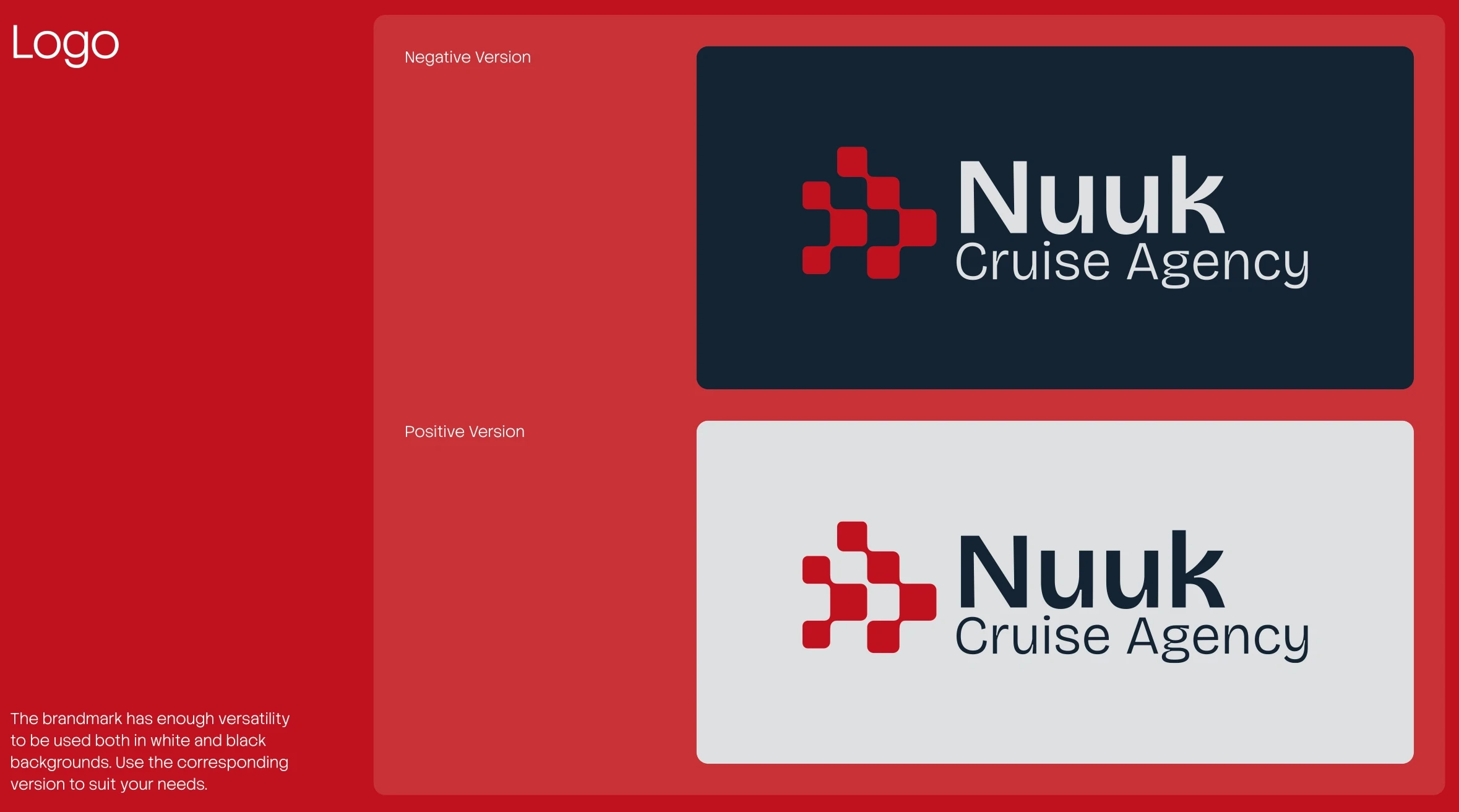
The idea, the force of 7, as 1, became the foundation for the identity. I created a logo system and layout language that could bring the group together under a consistent visual structure
The palette draws on the tones of the Greenlandic flag. Graphic containers echo the shapes within the logotype, creating a recognisable framework for applications across the brand.

(IDEA)
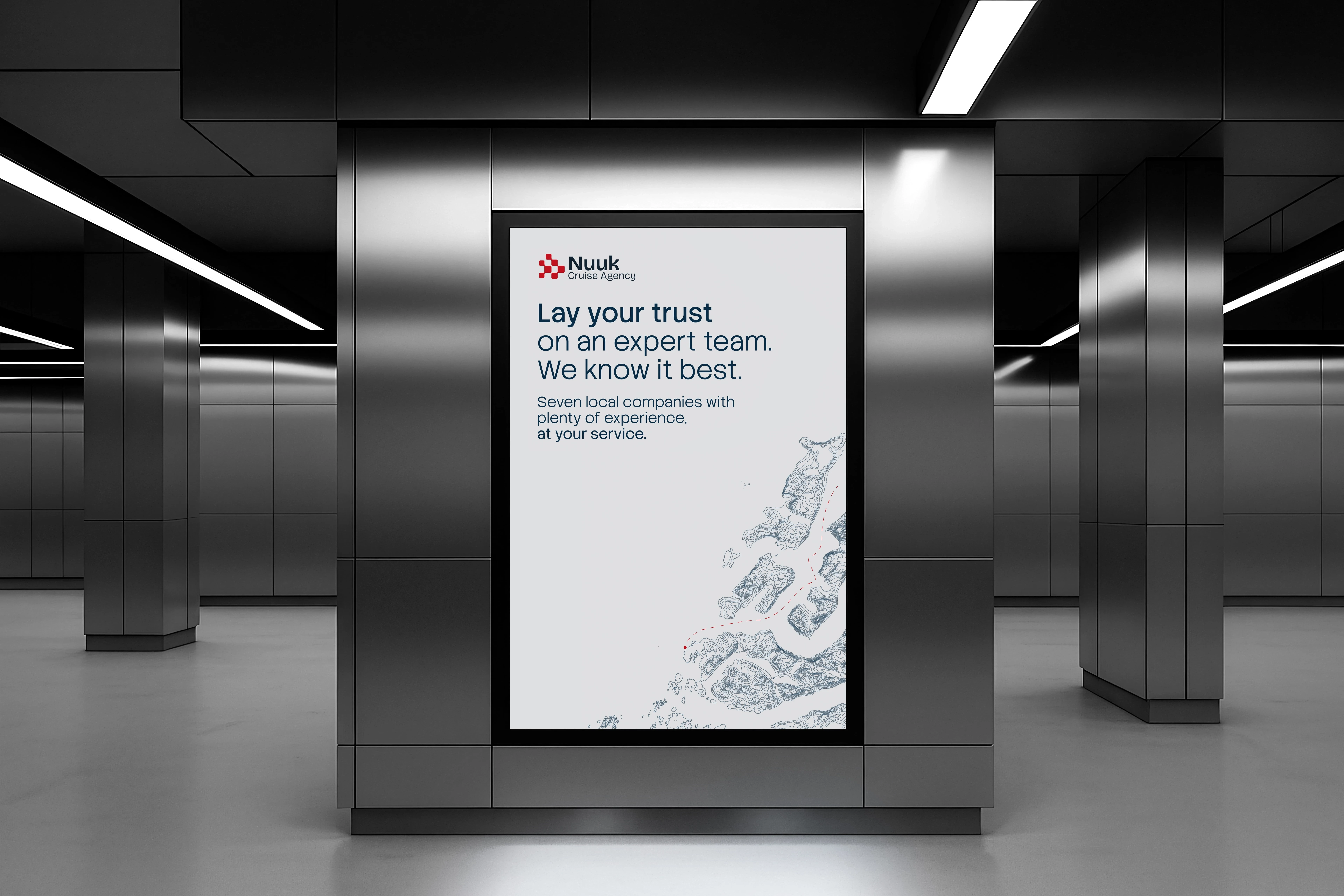
A topographic map of Greenland became a key part of the visual language. Finding usable source material took research, so I used a specialist mapping tool to extract the topographic information and turn it into vector artwork for the identity system.
That detail connects the brand directly to the landscape in which NCA operates.
(CHALLENGES)
NCA was formed to coordinate the logistics involved in managing tourist-boat cruises in the Nuuk region.
The brand had to express the strength of 7 separate businesses working toward one shared goal, without losing the sense of place that makes Greenland distinct.
(RESULT)
A unified identity for Nuuk Cruise Agency, built around the collective strength of its 7 member companies and the character of Greenland’s landscape.


